Divvy – Because Every Bike Deserves to See the City…
Divvy - Because Every Bike Deserves to See the City... Heading link
Update: All the data used for this visualization has been deleted because it was taking too much space on the server. Please contact us if you would like access to it.
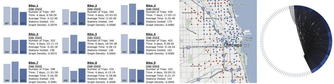
Bikeshare programs are becoming popular now in many cities around the world. Not only is it a great way to get around a city, these programs also generate tons of data that complex systems scientists love to study. In this visualization, we used data from Chicago’s own Divvy Bike system as part as their 2014 visualization challenge. Here, we focus on each and every individual bike, to see where it has had the chance to travel within Chicago. Click on the figure below to load the visualization. Note that you are asked how many bikes you want to include on the page and the default value is 2,887 (all of them), which takes about 10 seconds to load.
Some technical details: the data directly comes from Divvy and it contains all trips made from the start of Divvy at the end of June 2013 to the end of 2013. The data was first processed in python to generate each bike station usage map (resulting in more than 160Mb of data that you partially load by clicking on the maps), and each adjacency matrix for the chord diagrams (resulting in more than 530Mb of data); yes, data for 2,887 bikes take a lot of space! The visualization is done using the D3 library in javascript, and I was fortunate to benefit from the experience of many other people on the Web. As usual, comments are more than welcome!