Water Consumption Networks
Water Consumption Networks Heading link
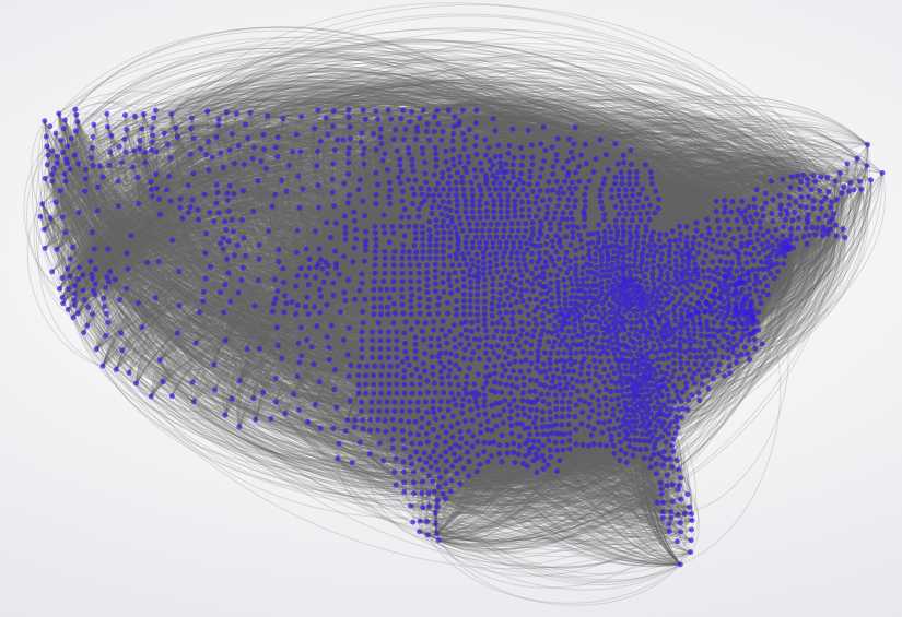
Let’s redefine how we analyze water consumption with this visualization. Here, Nasir Ahmad used daily per capita water consumption data at the county level from USGS for 2005 and created a network out of it. Essentially, we link two counties when consumption patterns are within +/- 0.5% of one another. This is a little like creating a “friendship” network, and two counties become “friends” when average per capita daily water consumption levels are similar. Surprisingly, the network is already quite large with 27,276 links for US’ 3,109 counties. It has a diameter of 277, an average path length of 77.09, and a graph density of 0.0056. Make sure to click on the figure to play with the interactive visualization. Like one of our olders projects, the static visualization was achieved with Gephi and the dynamic feature was produced with the gexf javascript library that can be downloaded here. When you click on individual nodes, the title of the node is the name of the county, the value next to “Nodes” represents the FIPS code (unique to each county – i.e. node id), the consumption values are in gallons per capita per day (gpcd), and other relevant metrics such as nodal degree are also shown. The search toolbar can be used to find individual counties, and the two buttons below the zoom slider are also fun, try them out. So who are the friends of your county?